
I had been putting off working on Pot Luck - the modern potholder quilt I began assembling in late April after receiving blocks from 15 other quilt makers. This has been the week to get it wrapped up.
Putting together the center section took time because I sewed binding to each block and hand-stitched it to the back, and then hand-stitched together all the blocks. But when the center was done it didn't feel finished to me. That's where I stalled until I decided to add hand-quilted wedges to each side, so as to set the center at an angle. I think it gives the whole quilt more interest.
 |
| Pot Luck, 57" X 57" awaiting last binding |
But making those sides wasn't as straightforward as I thought. Though the top and bottom wedges were easy enough to make and attach, it was the sides that gave me more problems. On both of them, I had to add more fabric and more hand-stitching to make them long enough.

However, now that the wedges are finished, I need only square it up and add binding. But now I'm wondering, which fabric for binding? Initially I thought the stripe would look best, but maybe Aruba (light aqua) is better because it allows the center to shine. Or maybe Bright Aqua?

Book Recommendations
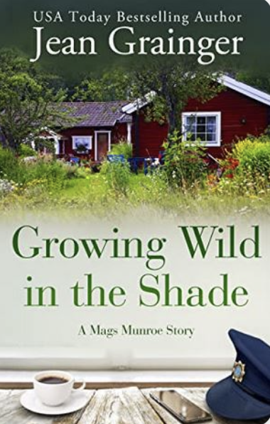
After listening to Jean Grainger's book Closer Than You Think that was (unbeknownst to me) book #4 in the Mags Munroe series, I've gone back to listen to the first two books - The Existential Worries of Mags Munroe, and Growing Wild in the Shade.
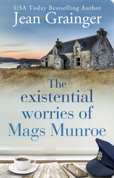
As with such "village" type books, we meet: Mag's mother who owns the local dress shop; Mag's best friend Sharon who is trying to get over a break-up with her cheating husband, Danny; and Kieren, Mag's husband who has a roofing business; and Mag's and Kieren's two girls.
I often smile while listening. The books are just charming!
Linda's score for both: 4.3/5.0

Lately, I've been captivated by something a friend shared with me. It's called "earthing" - the practice of intentionally spending time with bare feet on the ground to allow earth's negative ions to balance free radicals in our bodies and thereby reduce inflammation. It's a fascinating science.
If you haven't heard of earthing, I recommend watching the YouTube documentary "The Earthing Movie." It's is how I was introduced to it. Linda

I so much love "Potluck"!!! It's beautiful and so fun to just look at. I actually think it's a very calming force. I am sure you will choose the perfect binding. I like the bright aqua, but that's just me.
ReplyDeleteI am barefoot during the summer most of the time inside, and sometimes outside unless I have to walk on the bark in the vegetable garden or walking on rocks, but grass and dirt, no problem. I have heard of the earthing but haven't watched the documentary. I will look for it now!!! Thanks for the information.
I've read a couple of Jean Grainger's books and thoroughly enjoyed them. I will see if I can find these and put them in my to ready stack!!
Potluck is looking fantastic! The reason I would consider the light aqua (same color as the wedges) - is that it allows those gray wisps in the wedges to "carry on" off the quilt instead of being abruptly cut off by a different colored binding.....just food for thought.
ReplyDeleteI am 1/2 way through The existential worries of Mag Munroe.....and chuckling all the way. Her thought process is a hoot!
ReplyDeleteBright aqua ❤️❤️❤️❤️
ReplyDeleteThanks for weighing-in, Pamela. You're the second "vote" for Bright Aqua. But, the more I look at the quilt, and realize I want to keep the focus on the quilt center, the more I'm turning away from Bright Aqua or the stripe. While the Aruba would be the perfect color, unfortunately the piece of Aruba I have left is new-er, and not the same dye lot as the four outside wedges. For that reason, I'm going with Patty's suggestion to face the quilt. That will solve the dye lot problem (it will be on the quilt back), and (best) allow those wispy gray pieces to flow right off the edge of the quilt with no interference. But I DO appreciate your input. Thanks!
DeleteHow about a faced binding? That way the hand quilting goes all the way to the edge.
ReplyDeleteGreat job moving ahead on potluck, Linda! Fab quilting! I'm looking forward to seeing your choice of binding! I'm interested in trying that first book in the series you mentioned. But our library has 1 copy of the audio book and 47 people in line waiting!?!
ReplyDeleteSuch good decisions on Potluck- it looks wonderful. Bare feet- I love going barefoot, but we have fire ants on our farm. They are wicked little things that are up to your knees by the time you realize it!
ReplyDeleteWow! Potluck looks magnificent! I love the facing idea! That tilt was really a wonderful decision. Very visually engaging! Earthing: yes! It’s a very calming thing for the sole of feet to touch the earth. I personally love being barefoot in general, and especially love waking barefoot on sand like in the beach.
ReplyDeleteThat quilt looks like a lot of work even without the trouble on borders, but it's so fun to look at!
ReplyDeleteI would go for bright aqua :-)
ReplyDeleteI appreciate your input, Anonymous. However, I've already cut out and begun sewing facing to this quilt - rather than adding binding. Facing allows the wispy gray bits to float right off the quilt, and that's a much better look than putting binding on it, which would make a "this-is-the-end" statement. But again, thanks for taking the time to offer your opinion!
DeletePot Luck is looking great. I like the stripe for binding but as I'm catching up with emails I guess the quilt is finished by now :-) I decided to put a patchwork quilt on a tilt a few years ago. As you say getting those sides the right width and length was a lot more complicated than it looks! But worth the effort!
ReplyDeleteI was going to vote for the light aqua, but I see you've settled on a faced binding, and I think that's a terrific choice!
ReplyDeleteAs you can tell, I'm catching up on reading your blog. I'm not getting notifications again. Uggg. Thanks for book reviews. I think I'll look into the Irish books later this year.
ReplyDelete